
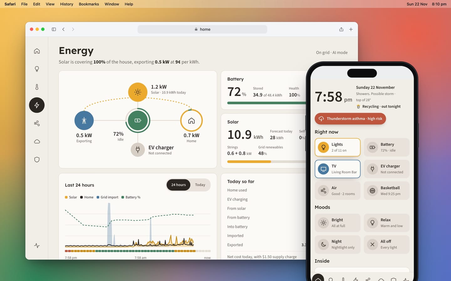
Part of the Home Dash series in The House Project. Last updated 22 November 2026.
Home Dash has been running the house for a few weeks now and it does the job. But it always looked a bit like a tech product. Cool greys, crisp white cards, very neat. Fine on a laptop, a little clinical on the wall in the kitchen.
So this weekend I gave it a makeover. The brief I set myself was short. It should feel calm and warm and it should never feel stressful. It's the thing you glance at on the way out the door, not a control room.
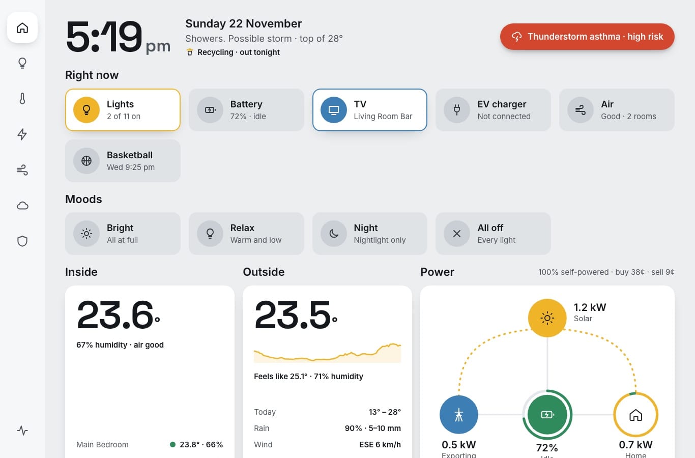
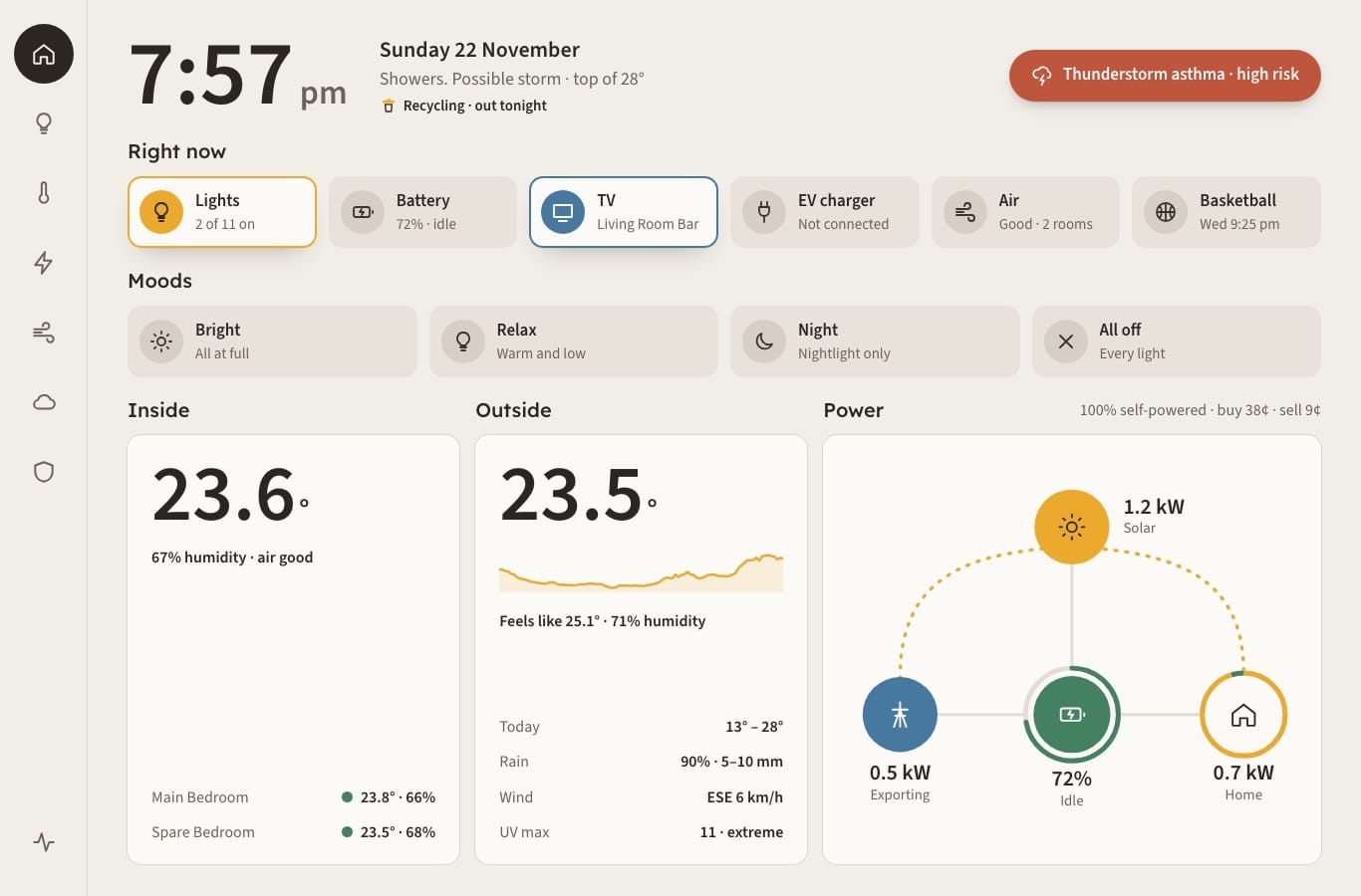
What changed
- The colours are warmer. Stone and paper instead of grey and white, with the same handful of colours for things that are on.
- New fonts. Headings have a rounder, friendlier face and every number uses a font where all the digits are the same width, so figures don't jiggle about as they update.
- Softer corners and fewer shadows. Only things that are actually on get lifted off the page.
- The home screen fits the tablet in one go, power flow and all.
Then the boring bit
A new coat of paint is the easy part. The real work was going over every page looking for the little things. Text that was a touch too small or too faint, buttons that were fiddly to hit with a thumb, long lamp names getting cut off and numbers splitting from their units at the end of a line.
It also works properly with a keyboard and a screen reader now. I hadn't thought about that for a house dashboard, but a screen the whole family uses should work for everyone.
Last of all every page got opened in a real browser at phone size and at desktop size, with every button pressed to make sure it actually did something. That turned up a few things, including one I'd broken myself that same morning. The update button on the System page had turned into a bare link floating on an empty grey pill. To be fair, that's exactly why you test.
What didn't change
Everything it does. Same pages, same information and the same rules underneath. Lit still means on, colour still means something and the battery still runs itself. Those rules have their own write-up in the design rules.
It's live on the wall now and the kitchen feels a bit less like an office. I've probably over-engineered it again, but I'm happy with this one.
Keep reading the series