Hybrid workplaces - have you heard of them? Sure you have. If not, you may be familiar with the word but a little unsure what it actually means.
I was really amazed at the changes LinkedIn made to their flagship office. Here they provide dozens of different configurations while significatly reducing the number of traditional worstations.
What Does This Look Like
LinkedIn’s hybrid workspace is spread over 239,000 sq. feet consisting of six floors.
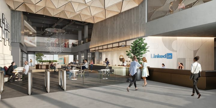
Upon entering the building you are greeted with a cafe-style entrace where you feel the hustle and bustle of people. Right next to the cafe is a big lounge where a lot of people start their day.
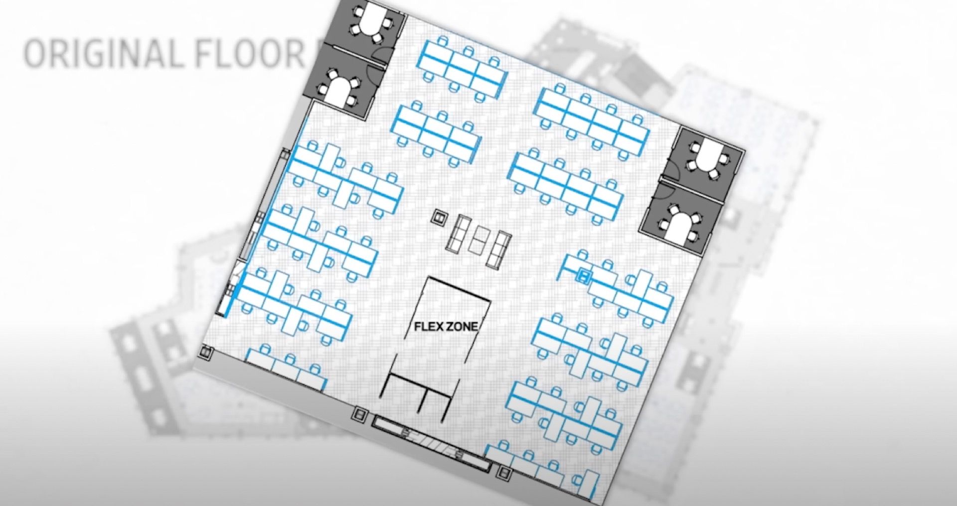
Looking over the original floor plan on level 2, it was built out cater for 1080 workstations. I see this as the tradional battery hen configuration.


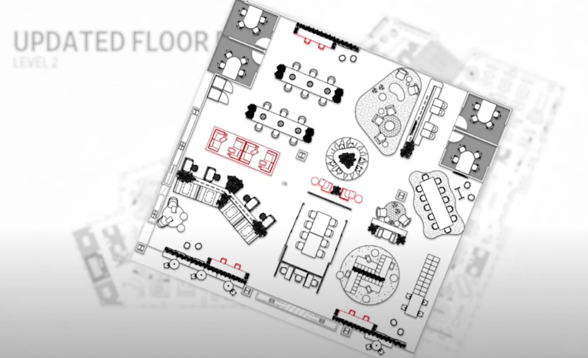
Where did that extra space go? After cutting workstations to half, they added unorthodox seating designs as they wanted to do experiments to meet growing demand accoriding to Robert Norwood, Interior design principal at NBBJ. This new design caters to many varieties - booths, small meeting rooms and so on.
The second floors primary space has been allocated for co-working. It's designed for those who only need to visit for a small amount of time. This is great for small teams who need to catch up. Gone are the sea of monitors and desks and replaced with couch like chairs and ottomans.
New Concept: Living Space and Neighbourhoods
The concepts of living spaces and neighbourhoods have been can be seen throughout. A living space is the area allocated to a team, whereas other teams working at a distance may be called a neighbourhood. The floor is furnished with both traditional and now modern flexibility.
They've gauged the amount of time a person would spend working in a particular space through a concept known as the Posture’s Matrix. For this, they have high and low tables, e.g. a person spends less time in high chairs for 30-60 minutes.
Hardest Room. The conference room
In the hybrid workspace, individual rooms are far easier to design for. It is the conference room that is the hardest.
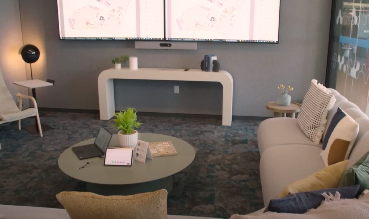
Linkedin's conference rooms have now incorporated some non-traditional elements. It's space is more akin to working from home with a large sofa sitting at a neutral position.

There's also plenty on new technology used with whiteboards that project what the speaker may write.
Is this the future modern workspaces? The work space is there to encourage and welcome employees. It acknowledges that remote work is the future of productivity and those who want to come into the office has a place to work.


